✎ᝰ plotting.acf_pacf
The AcfPacfPlotter class provides functionality to visualize the Auto-Correlation Function (ACF)
and Partial Auto-Correlation Function (PACF) for time series data. This module is designed to
help users understand the correlation structure of their time series data by generating informative plots.
Overview
The module exposes a plotter class that:
Accepts a pandas DataFrame or Series
Plots ACF and PACF for selected columns or series
Supports configurable lag values and plot customization
Leverages matplotlib and statsmodels for visualization
Class Reference
- class owlmix.plotting.acf_pacf.AcfPacfPlotParams(columns=None, n_lags=10, precision=4)
Dataclass for specifying ACF/PACF plotting parameters.
- class owlmix.plotting.acf_pacf.AcfPacfPlotter(data, params)
Plots the Autocorrelation Function (ACF) and Partial Autocorrelation Function (PACF) for specified columns in a pandas DataFrame or a single Series.
- Parameters:
data (
pandas.DataFrameorpandas.Series) – Input DataFrame or Series containing time series data.params (
AcfPacfPlotParams) – Configuration parameters for ACF/PACF plotting.
- generate(output_dir: str = 'outputs/charts') str
Generates and saves ACF and PACF plots for each specified column or series.
- Parameters:
output_dir (
str) – Directory to save the generated plots.- Returns:
File path to the saved ACF and PACF chart image.
- Return type:
str
Sample Output
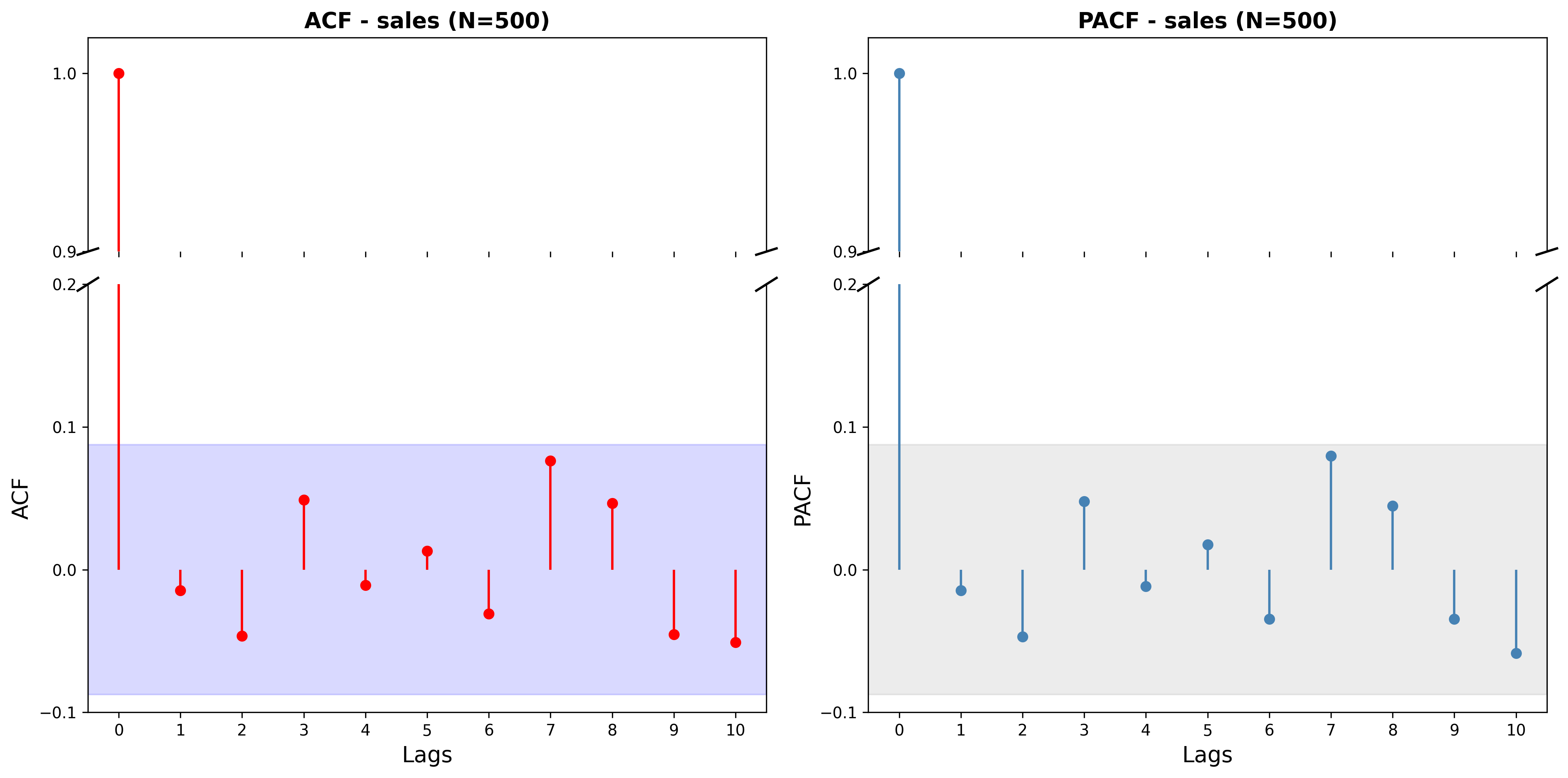
ACF and PACF plot typically consists of two subplots: the upper subplot shows the ACF values for each lag, while the lower subplot shows the PACF values. Each bar represents the correlation at a specific lag, and horizontal lines indicate confidence intervals. Significant correlations outside these intervals suggest potential patterns in the time series data.